
Mobile Case Study
Increasing Revenue with a New AllTrails+ Feature
Role: Designer & UX Researcher
Impact: Increased revenue by $2.6 million annually
The Problem
In spring of 2022, as part of a company-wide initiative to increase revenue, each product team at AllTrails was given an objective: come up with one new paid feature that could be delivered during our peak season, just a few short months away.
The business goal: drive new units of AllTrails+ subscriptions
Defining the
User Need
Our team was responsible for the search and discovery experience so we started with existing user insights specific to our product area:
When surveyed, 77% of free searchers indicated that time is the biggest barrier to getting outside more often.
Around 50% of these users are willing to travel up to 20 miles by vehicle (20-40 minutes), but not more.
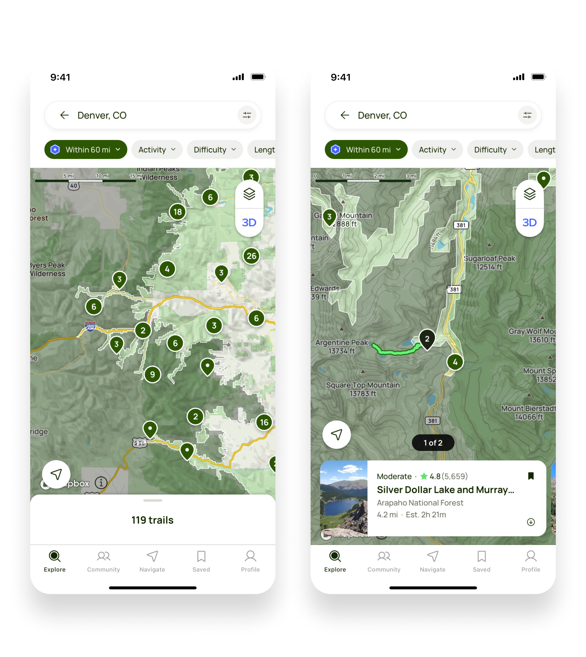
We conducted additional interviews to better understand how users were overcoming these barriers to get outside. The current process was a manual one. While they could easily filter out trails that were too long or too difficult, there was no simple way to exclude trails that were too far away. The typical flow consisted of picking a trail from the Explore page, pulling up the directions in Google or Apple Maps, then determining if the trail was within the maximum driving distance they were willing to travel.
The key takeaway: If we could make it easier for users to see which trails fall within their comfortable driving distance, we could reduce their barrier to getting outside more often.
Considerations
My Product Manager and I ran the gamut to create a design solution that solved the user need elegantly while still being technically feasible. We collaborated with our map services provider, brainstormed solutions with our server and front-end engineering teams and conducted additional rounds of user interviews and usability tests to inform our decisions.
We had to be careful not to degrade the existing search and discovery experience, the highest trafficked area of the product and the first experience for new users. We also had only 3 months to complete designs, build the feature, and get it launched by the start of our highest traffic month. No pressure!
The Solution
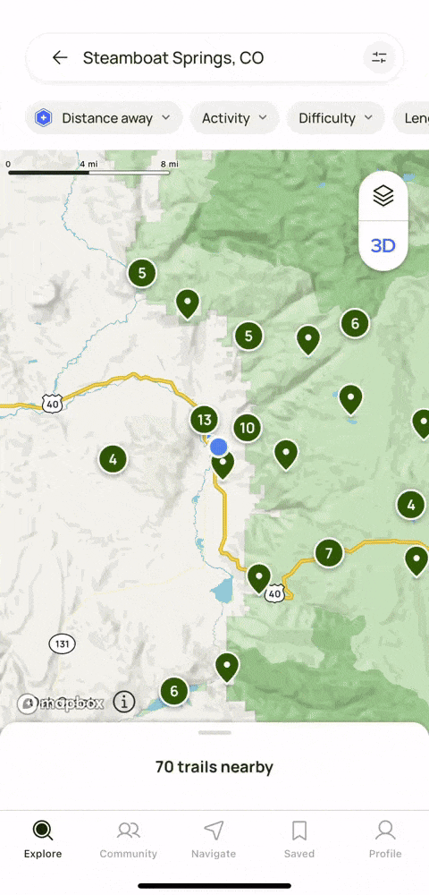
The intersection of user need, business need, technical ability, cost, and time led us to our final solution: a paid filter that would allow users to set a maximum limit on how far they were willing to travel, by road, to a trail.
There were alternative ideas that we felt compelled to pursue but just weren’t possible within our constraints. The idea of a “Distance away” filter and the future enhancements it could unlock sold us (and our stakeholders) for several different reasons:
It was cost-effective to implement: The backend API that we sourced was cost-effective and integrated into our existing map experience seamlessly, keeping our engineering effort low.
It created a foundation we could build on: This included future improvements like allowing users to adjust their mode of travel (walking, biking, driving), the ability to add traffic-specific travel time, the ability to apply the filter to a specific address (a hotel or campsite address, for example), and the ability to layer in a trail’s “estimated time to complete” to help users find trails they could drive to and complete within a specific timeframe.
It supported additional product goals: Integrating this data brought us closer to a future state where we could incorporate distance information onto trail cards themselves, one of our most highly requested features.
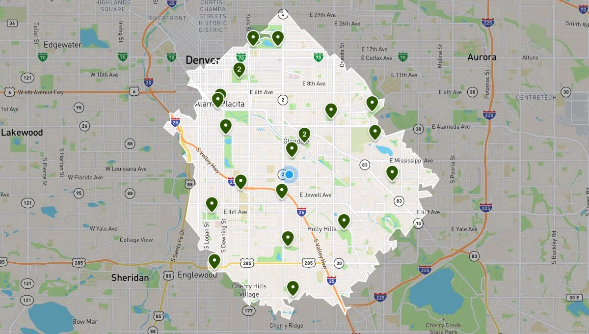
The isochrone, the shape that identifies the boundary, was a collaborative effort between myself and our front-end and server engineers. We worked to ensure that it was legible on all of our different map styles and fit within our design system while also being uniquely identifiable.
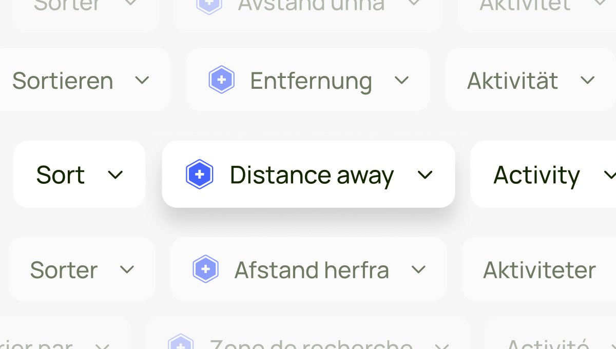
I conducted several rounds of user research to determine both the name of the filter and its placement within our existing filter set and partnered with our translations team to create custom names for our international markets.
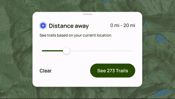
Every time we render a list of results, we pay a fee to our map provider so limiting the mileage options on the slider and utilizing a button to apply changes ensured that we could keep our usage costs low. The addition of these numbers also improved comprehension during usability testing.
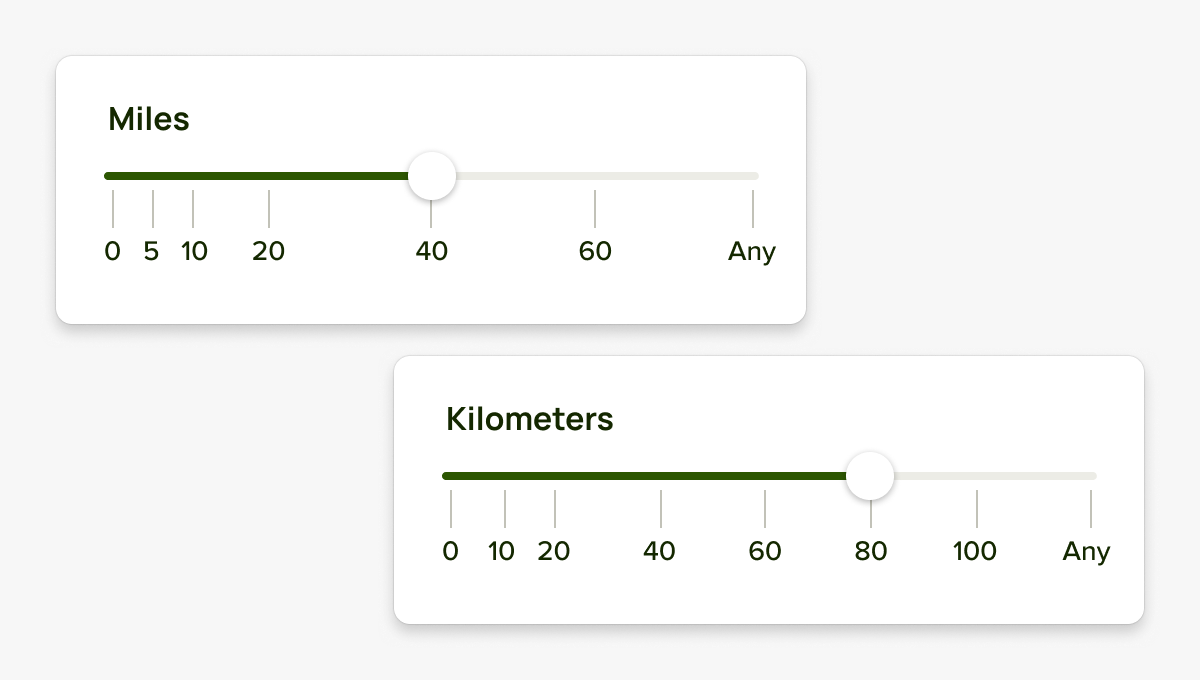
The mileage numbers were customized for metric and imperial systems based on user feedback. I tested them in multiple markets to ensure the numbers we included fit the largest user need.
Fun fact: the most used distance increment is 20 miles
Measuring the Impact
We saw immediate adoption of the feature by both existing paid subscribers and free users and a 5% conversion rate
In its first 6 months, Distance away brought in over 1 million in revenue.
Since then, it has continued to convert an average of 73k new subscription units annually (over $2.6 million of revenue per year) and has contributed to a higher rate of subscription renewals.
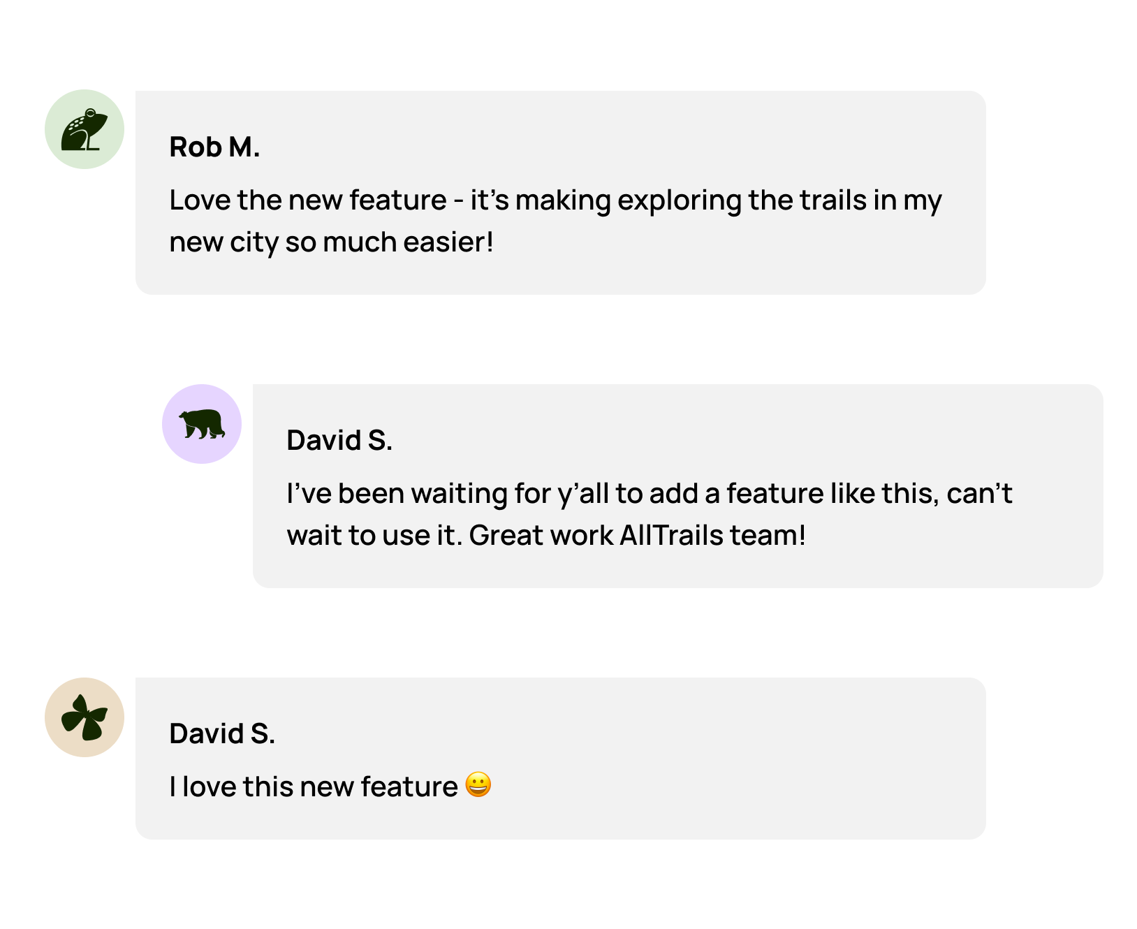
User Feedback
The Team 💚
Product Manager: Sydney Cho
Content Design: Ali Burke
Server Lead: Dave Donahue
Server Engineer: Erica Schleimer
iOS: Geoff Raeder
Android: Mike Wideman
Web: Will Haley
QA: Nancy Reynolds